DESIGN: Grey’s Dermatology
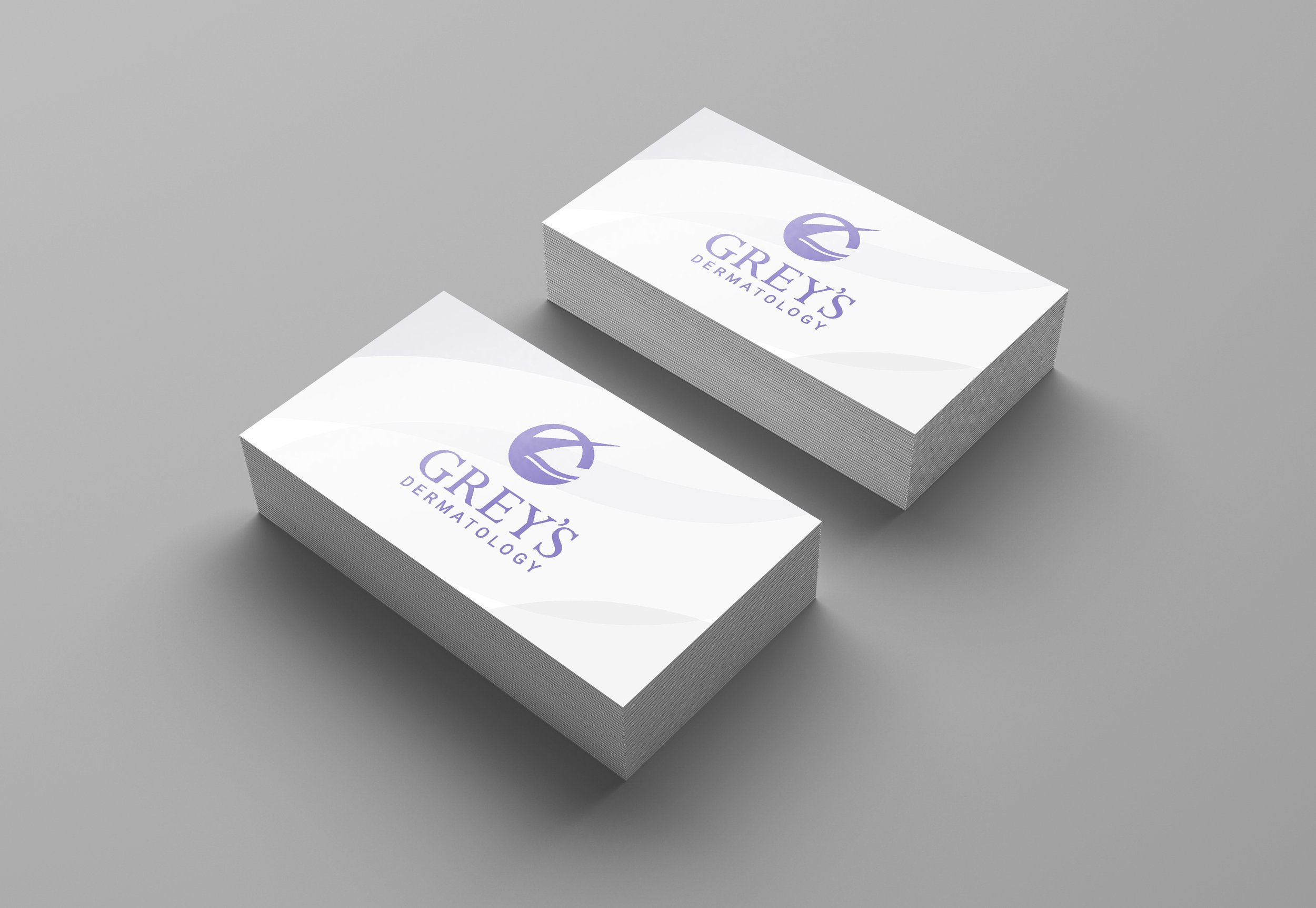
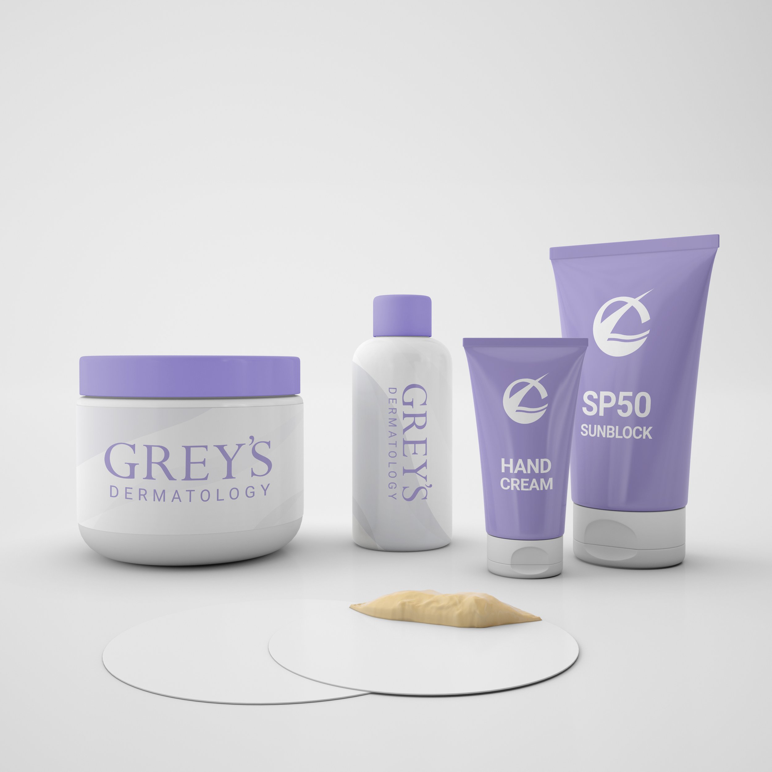
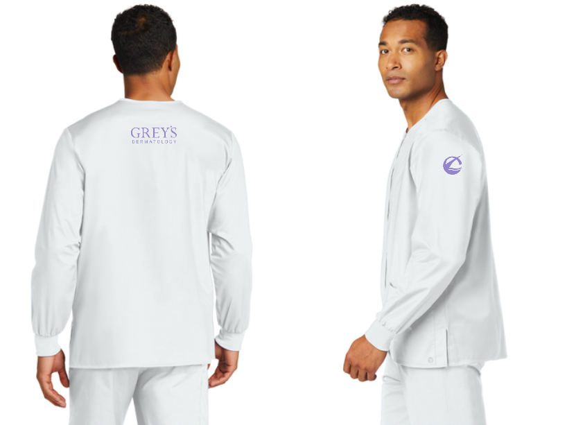
Although not illustrated below, this project was a tricky process in meeting two distinct visions for the brand’s imagery. The client was interested in clearly symbolizing the specialty of the business leading to a direction which is a little too illustrative or too detailed for an icon. The designer’s vision was to develop a future-proof simple icon that can easily be used and recognized but will require some time to establish awareness.
With careful exploration and collaboration, a balanced was eventually achieved matching the two visions.


The images shared represent the vision of our client and designer and may not accurately reflect the current available products. Design concepts are subject to change, and actual products may differ.
Visit the design portfolio to discover more works by Hector John.